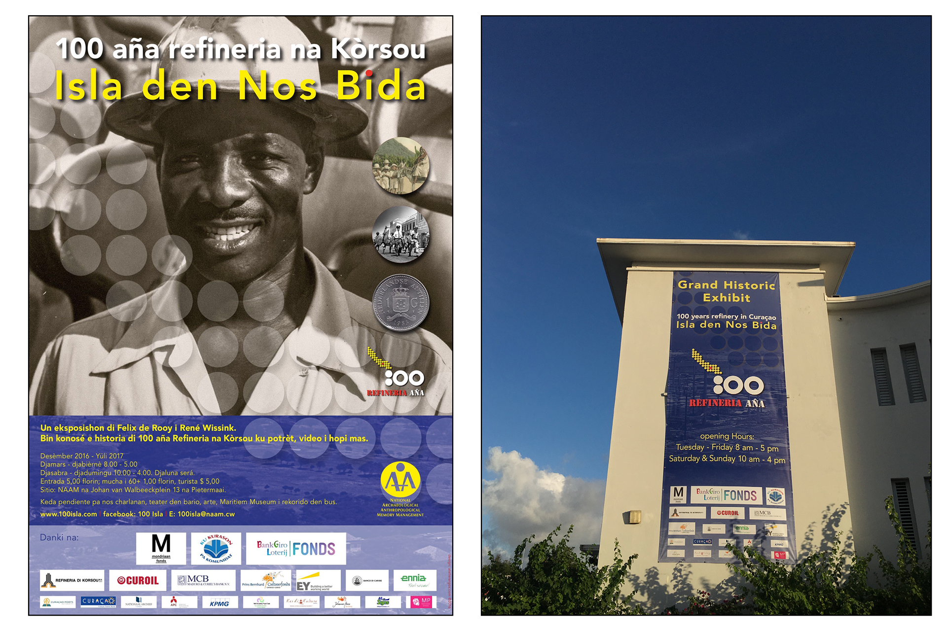
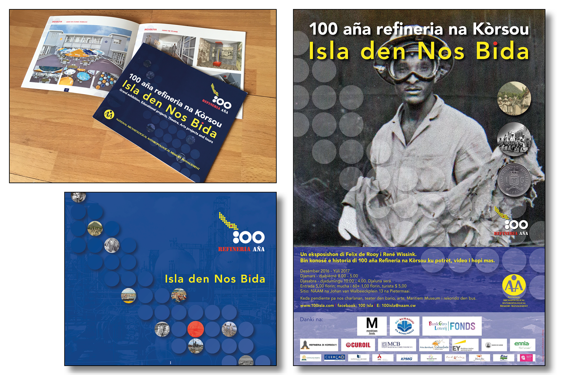
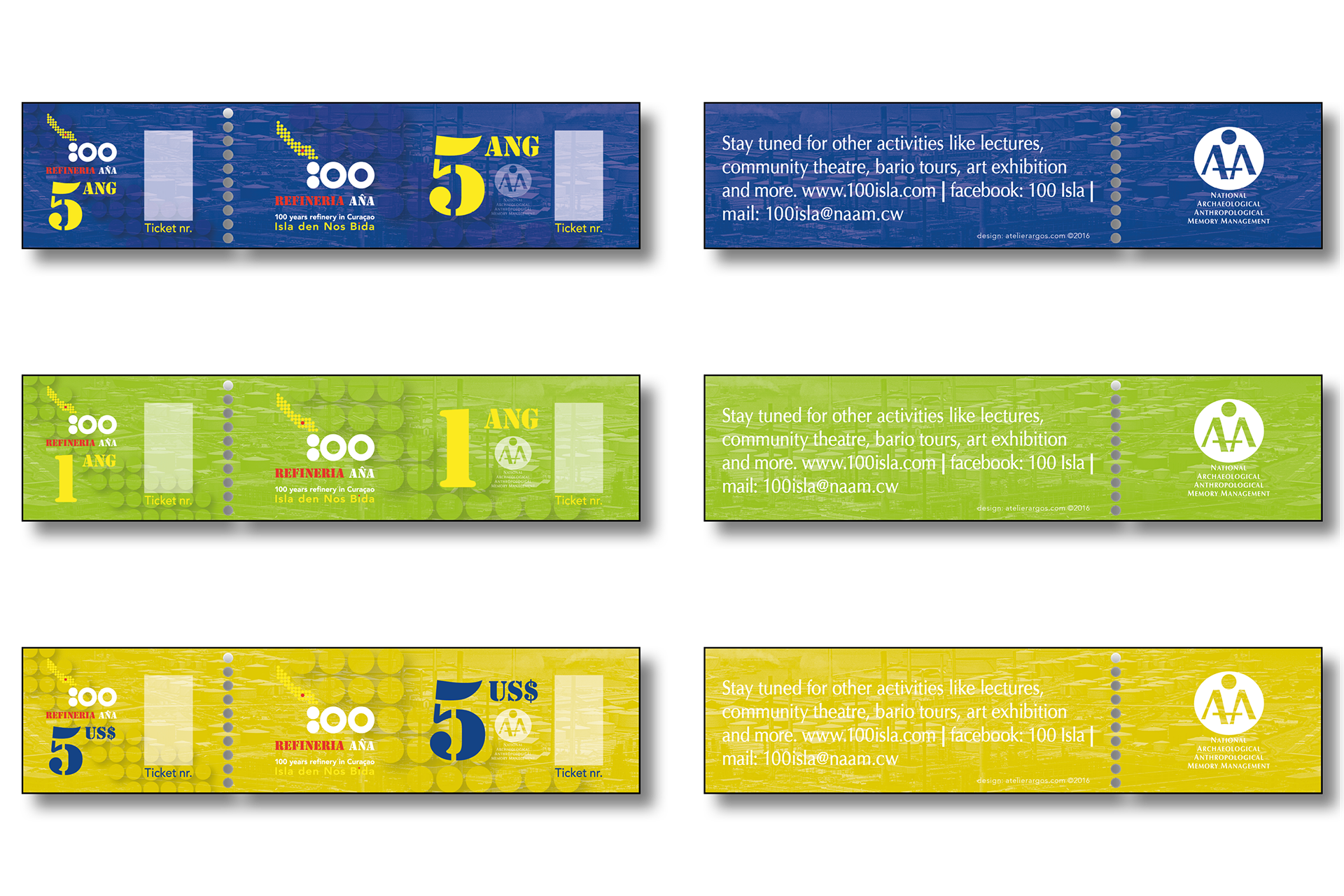
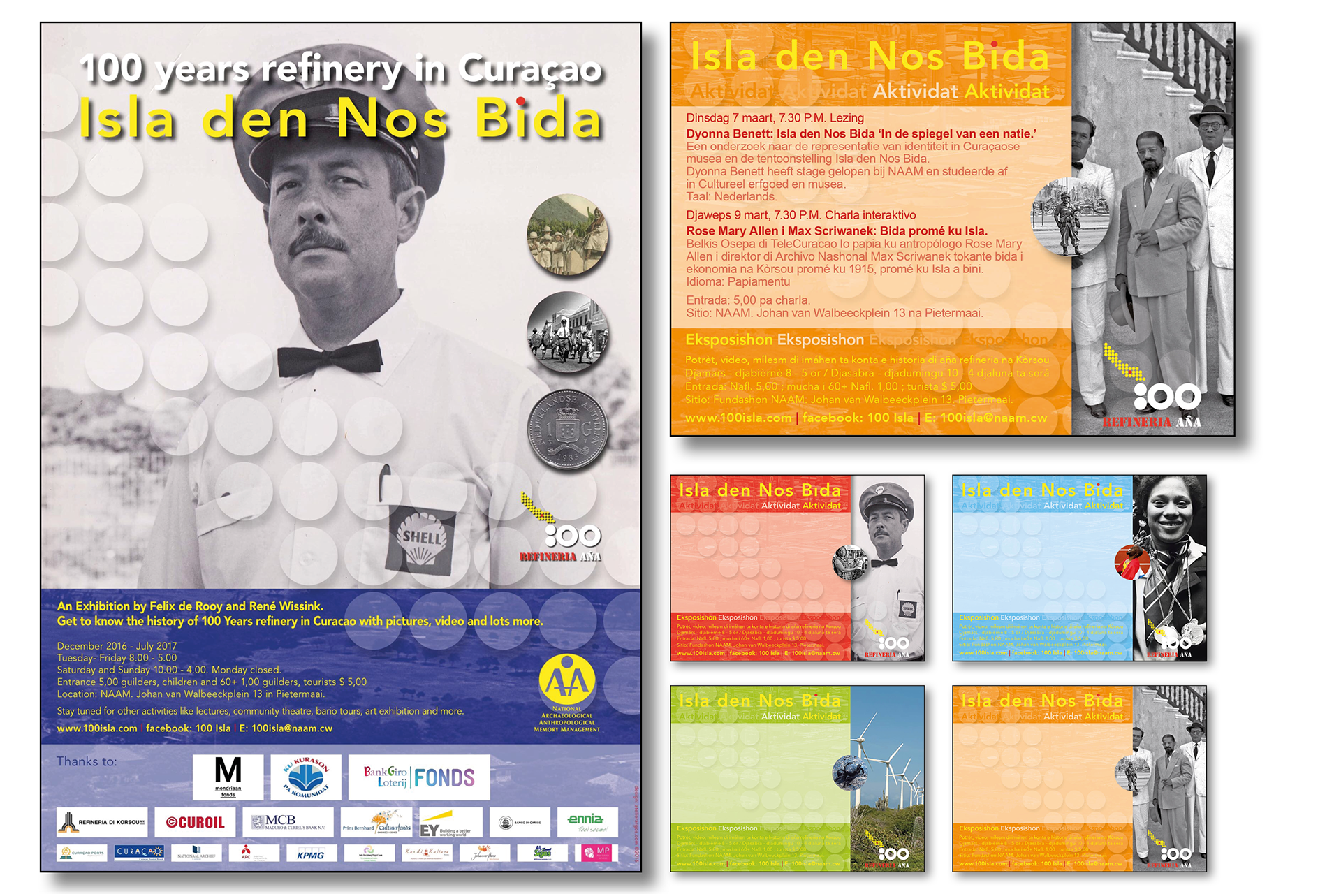
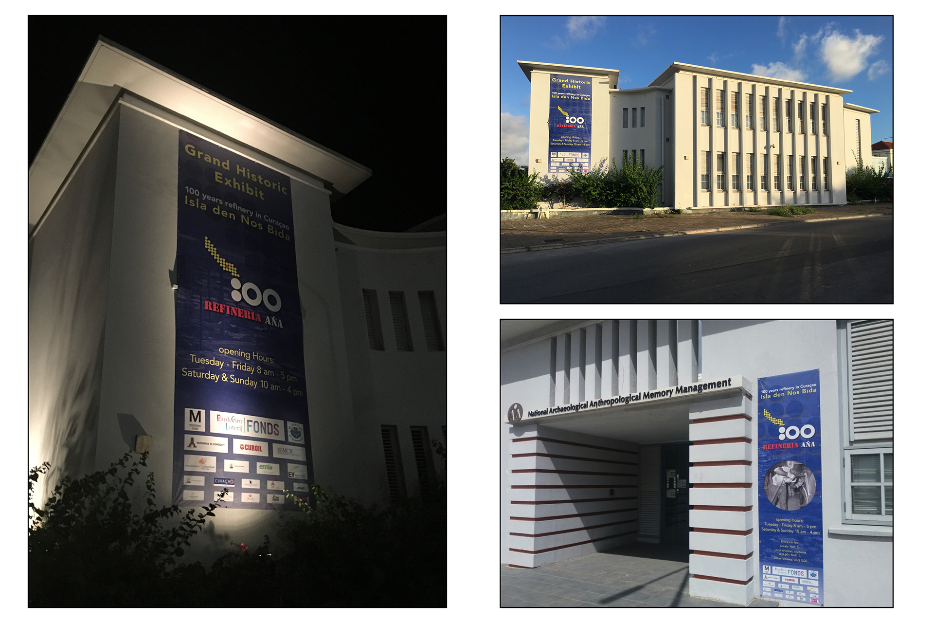
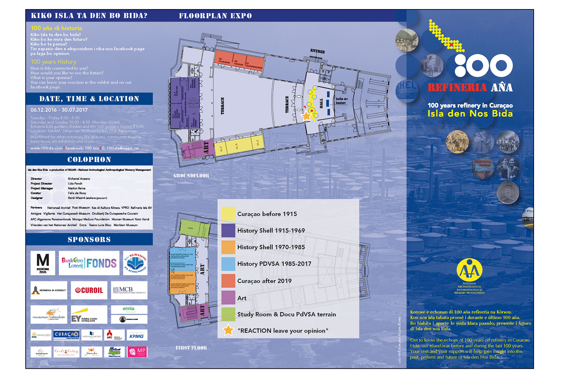
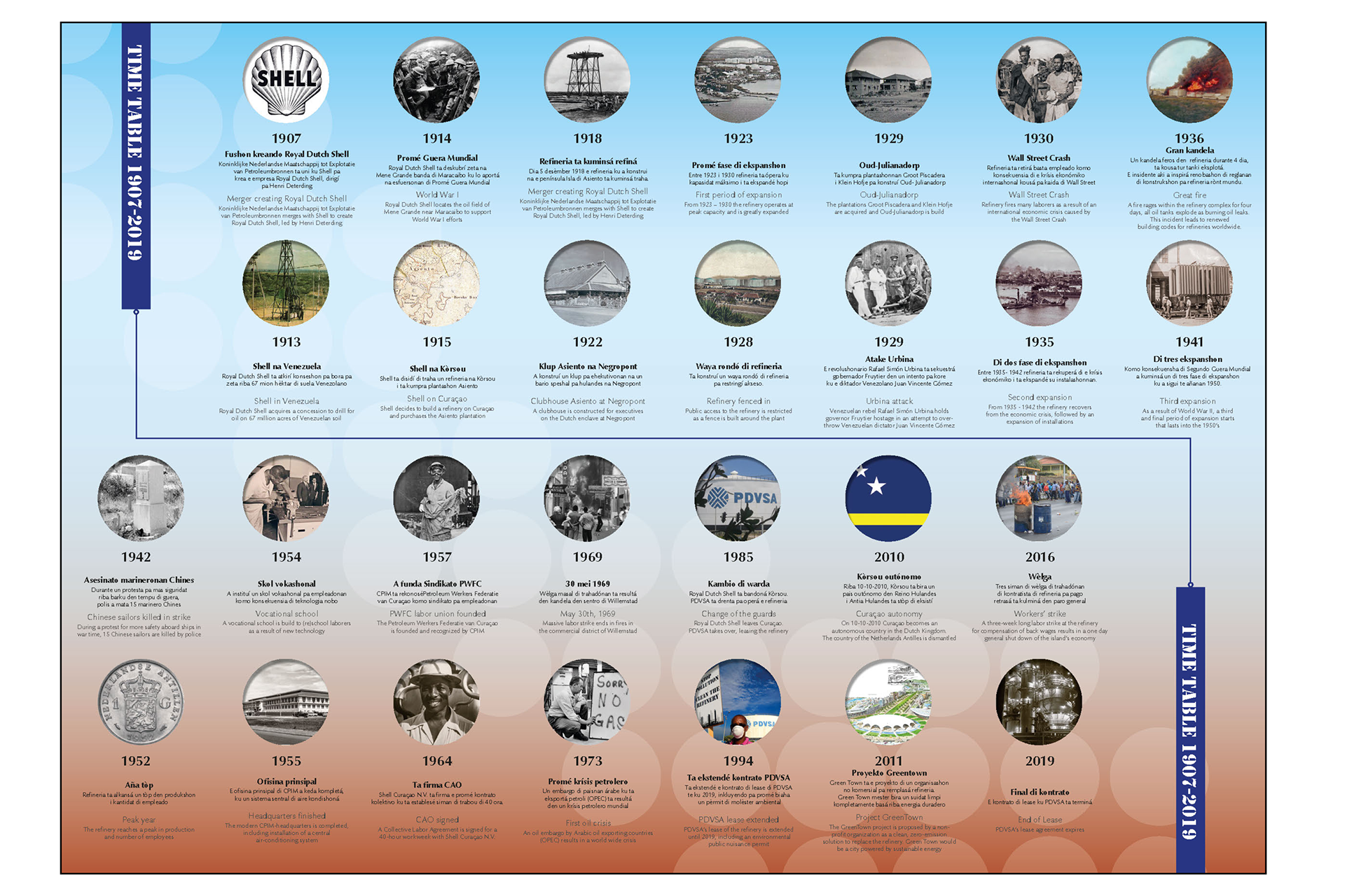
For the exhibition "100 years Curaçao refinery", Atelier Argos designed all the printed matter. Posters, tickets, advertisements, books, banners and various flyers.
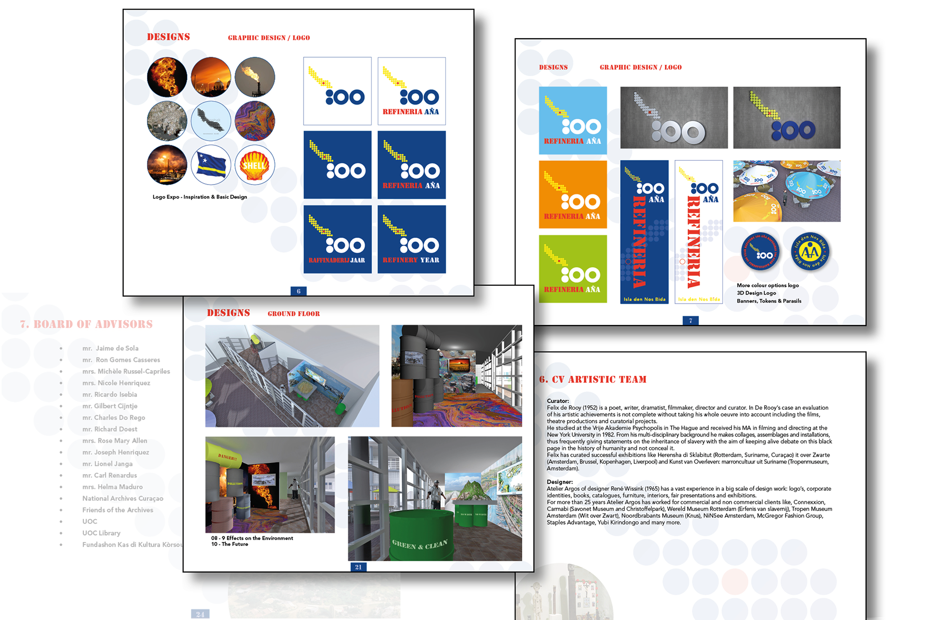
The thoughts behind the logo are as follows:
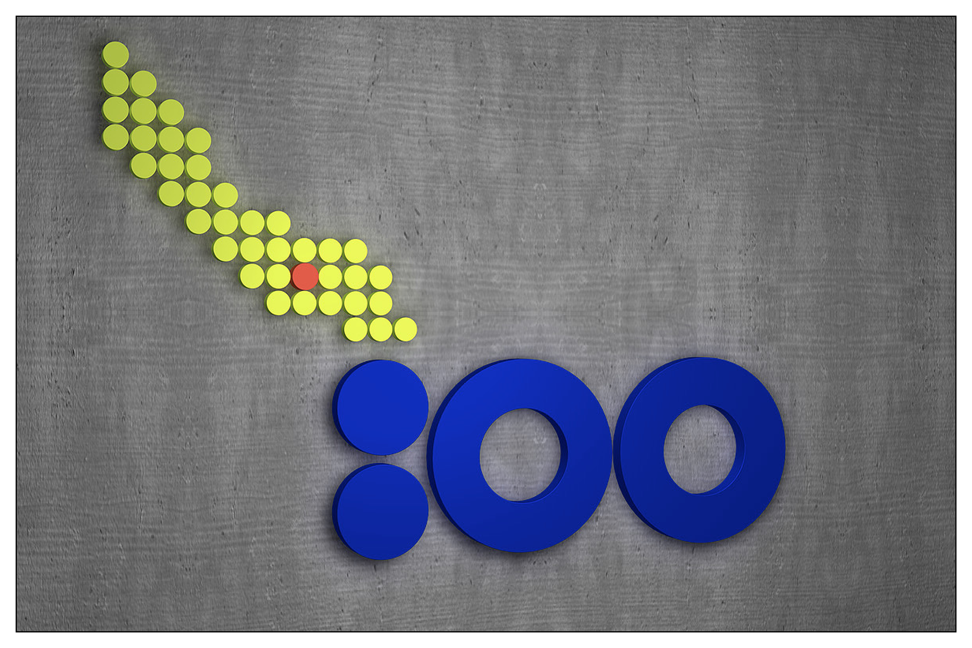
The island has grown big by the oil but is also heavily polluted by the same refinery oil. The word 100 is made up of circles, the oil tanks. The island is made up of circles that represent the flames from the refinery, the particles that pollute the island and the place where the refinery is located on the island (red dot). The yellow and blue are the colors of the flag of Curaçao. Yellow and red are the colors of Shell and blue is the color of the PDVSA.
In addition to these colors, a number of supported colors have been developed. Green, Orange, Light Blue and Red.
Voor de expositie "100 jaar raffinaderij Curaçao" ontwierp Atelier Argos al het drukwerk. Posters, entree tickets, advertenties, boekjes, banieren en diverse flyers.
De gedachten achter het logo zijn de volgende:
Het eiland is groot geworden door de olie maar is ook zwaar vervuild door dezelfde olie uit de raffinaderij. Het woord 100 is opgebouwd uit circels, de olietanks. Het eiland is opgebouwd uit circels die staan voor de vlammen uit de raffinaderij, de deeltjes die het eiland vervuilen en de plek waar de raffinaderij zich bevind op het eiland (rode stip). Het geel en blauw komt uit de kleuren van de vlag van Curaçao. Geel en rood zijn de kleuren van Shell en blauw is de kleur van de PDVSA.
Naast deze kleuren zijn er een aantal ondersteundende kleuren ontwikkeld. Groen, Oranje, lichtblauw en rood.